The case study
Two users. One product. A genuine tension.
The beginner needs a clear path. A sense of forward motion. The reassurance that they're going the right way and that the next step will appear when they're ready for it. Too much choice is overwhelming. Too little guidance feels abandoned.
The expert needs to get out of their own way. Immediate access to every capability. Nothing between them and the work. Anything that feels like hand-holding is friction — and friction, for someone who knows exactly what they want, becomes a reason to leave.
These two users are not edge cases. They are the product's entire audience. And their needs are in genuine tension.
The question was never how to choose between them.

The solutions that don't work.
Every obvious answer to this problem has a cost that compounds over time.
Two separate apps doubles every maintenance burden — two codebases, two design systems, two sets of bugs, two deployment pipelines. For a solo developer, that's not a tradeoff. It's a slow collapse.
Subscription-based feature gating restricts capability based on payment, not skill. The experienced user who finds the product and wants immediate access to advanced features encounters a paywall. That's not a product decision — it's a trust violation dressed up as a business model.
Onboarding branching creates permanent forks. A user who starts in the beginner branch and outgrows it has no natural path forward. In a product explicitly designed for progression — where the entire point is that users will outgrow their starting point — permanent branching is a contradiction.
A single undifferentiated interface serves neither user well. The beginner is overwhelmed by options they aren't ready for. The expert is slowed by guidance they don't need. Both feel like the product wasn't made for them.

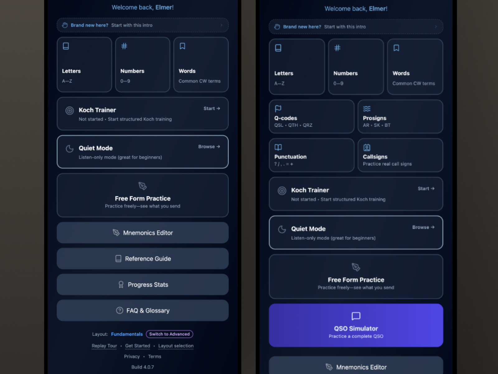
The solution: a display preference, not a product tier.
Treat user level as a display preference. Not a capability gate. Not a subscription tier. Not a permanent fork.
Both paths are the same application. Every screen, every component, every feature, every line of logic exists in both. The difference is what appears prominently and what is de-emphasized — not what is allowed and what is withheld.
When nothing is hidden, there is no wrong choice. A beginner who accidentally selects the advanced path sees a fuller interface — mildly confusing, easily corrected. An expert who starts in the beginner path encounters guided framing — mildly slower, immediately fixable. Neither outcome is a failure. Both are recoverable in one tap.
The architecture accommodates curiosity. It expects progression. It was designed for users to outgrow their starting point — because that's the entire purpose of the product.

What changes. What doesn't.
In the beginner path: The primary training engine is featured prominently. Advanced features are present but not dominant. Contextual guidance appears at moments of potential confusion. Milestone acknowledgments are more expressive. Help is closer to the surface.
In the advanced path: The full feature set is presented at equal weight. No single option is featured above others — experienced users know what they want and resent being steered. Guidance is quieter. Every capability immediately accessible.
What stays identical: Every screen. Every component. Every feature. Every piece of logic. Zero duplication in the codebase. A single source of truth maintained across every sprint.

Switching is the feature.
The path toggle lives in Settings. One tap. No confirmation dialog. No warning. No data lost.
Making switching frictionless does something important: it removes the fear of the wrong choice. A beginner who is curious about the advanced path can look without committing. An expert who wants to revisit the guided framing can do so without ceremony.
Fear prevents exploration. Safe, reversible switching means users will move when they're ready — and return when they're not. The architecture trusts them to know.

The moment the architecture becomes visible.
There is one designed moment in the beginner path where the two-path architecture becomes explicitly visible to the user.
When the foundational training sequence is complete — when the learning engine confirms the threshold has been met — a modal appears. Not a screen. Not a notification. A modal, in context, at the moment it's earned.
The tone is specific. Not celebratory. Not congratulatory in the way a game would be. This is a serious milestone for someone who has worked seriously toward it. The copy acknowledges what was accomplished and explains what it means in real terms — what the learner can now do in the world that they couldn't do before.
Then it opens a door. An explicit prompt to switch to the advanced path. Not a requirement. Not a redirect. A door, clearly marked, at exactly the right moment.
Without this moment, a learner who completes the foundational sequence has no signal that more exists. The modal is the bridge — making the architecture visible precisely when the user is ready to cross it.
Earned recognition, not a confetti screen.

Progressive disclosure as respect.
Nothing in this product is hidden. Every feature is accessible to every user at all times.
What differs is what gets surfaced. What appears without the user having to look for it. What the default state of each screen treats as primary.
Progressive disclosure, done well, is a form of respect. It says: I know what you need right now, and I'll show you more when you're ready. It doesn't say: I've decided what you're allowed to see.
That distinction — between trust and gatekeeping — is the design principle that holds the whole architecture together.

One codebase. Every sprint.
The discipline this architecture demands is ongoing. Every new feature has to be designed for both paths simultaneously. Every sprint has to consider how a component behaves in the beginner context and the advanced context. Every design decision has to hold at both levels of the information hierarchy.
In practice, this constraint produces better design. A feature that can't be integrated cleanly into both paths is usually a feature that hasn't been thought through completely. The dual-path requirement acts as a design review — if it doesn't fit both, it doesn't fit.
Zero feature duplication across hundreds of sprints. A single source of truth. Two experiences, one product.

When one experience becomes two — the architecture earns its invisibility. Both users feel at home. Neither knows why.