The case study
Most interfaces wait for a click.
The input isn't a tap. It's a duration.
A click is simple. A discrete event. Pressed or not pressed. On or off. The entire history of web interaction design is built on that binary.
This interface had to do something different. It had to listen to time.
Not just whether something was pressed, but for how long. The silence after. The ratio between the two. Whether a second contact arrived before the first finished. All of this within millisecond tolerances, on a device that was never designed to think about any of it.
The hardware.
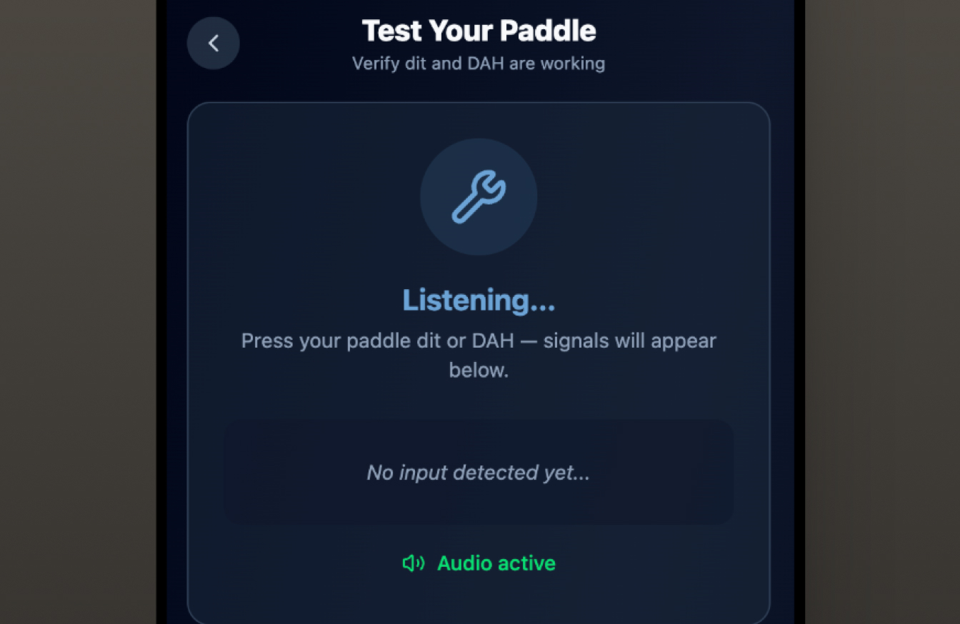
Guided setup — confirmed before the first session begins.
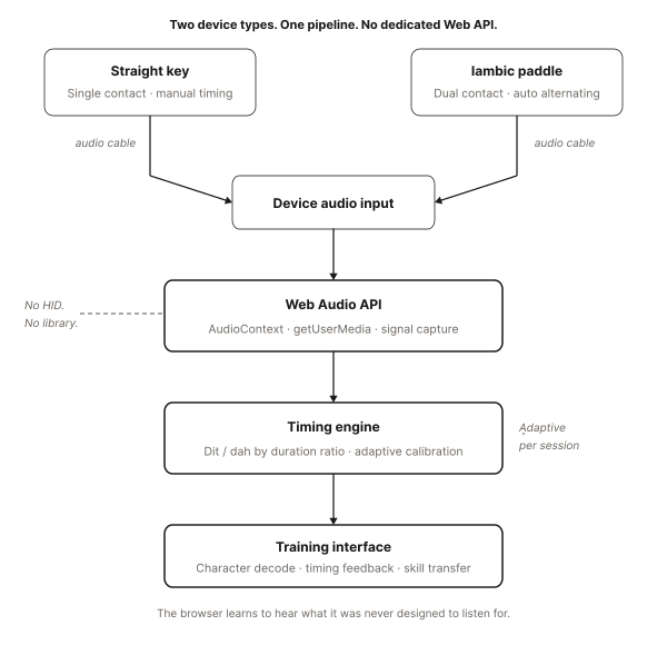
The platform needed to support professional-grade physical input devices, specialized hardware that generates patterns based on how and how long it's pressed. Two device types with fundamentally different interaction signatures.
The simpler type: a single contact. Press and hold for a long element. Press and release for a short one. The operator's hand controls everything: duration, spacing, rhythm.
The more complex type: two contacts, one for each element length. The operator's hand chooses the sequence; the system generates each element at its exact duration.
Both reach the computer through a small adapter. Neither was designed for a web browser. There is no dedicated Web API for this kind of input. No library. No established pattern. What the browser receives is a raw stream of press and release events, stripped of all context, and that's where the known terrain ends.
The problems that had to be solved.
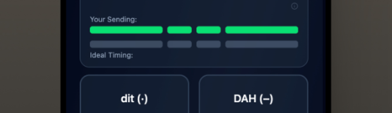
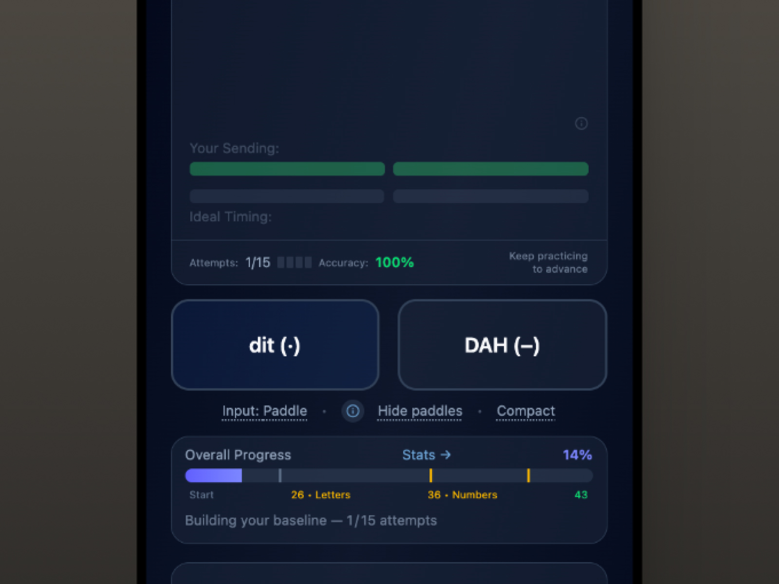
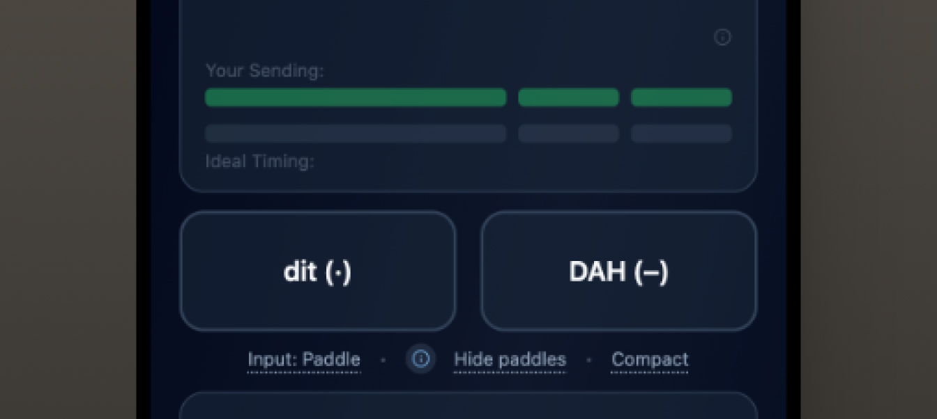
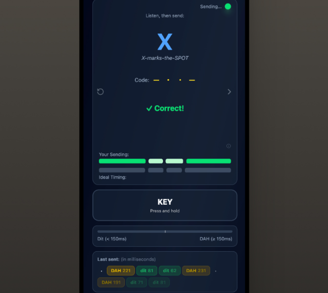
Timing bars — what was sent against what the character calls for.
Building this from the ground up meant confronting problems that standard web development resources simply don't address.
Any perceptible delay between physical press and audio response breaks the feedback loop that makes practice useful. The operator's hand and ear are in real-time conversation, and lag turns that conversation into noise. The audio architecture schedules sound ahead of time rather than reacting to input. Working with that constraint, not against it, was the first design decision.
The difference between a short and a long element is a ratio, not a fixed duration. At higher speeds, tolerances tighten considerably. A fixed millisecond threshold fails. The timing model derives every threshold from the operator's target speed, so the same ratios hold as speed climbs.
The event stream itself is unreliable in ways a click never is. Physical contacts bounce, firing phantom duplicates within milliseconds of a real press. Fast transitions between the two contacts arrive nearly on top of each other. And a press event can arrive with no matching release, leaving the system believing a contact is held forever. The input layer had to absorb all of it without losing track of where it was.
On iOS, Safari requires an explicit user gesture before audio can start. A session that begins without it produces silence, a critical failure in a product where the sound is the entire point. Every entry point into the practice environment had to be audited and wired to the audio initialization flow.
Designing the feedback layer.
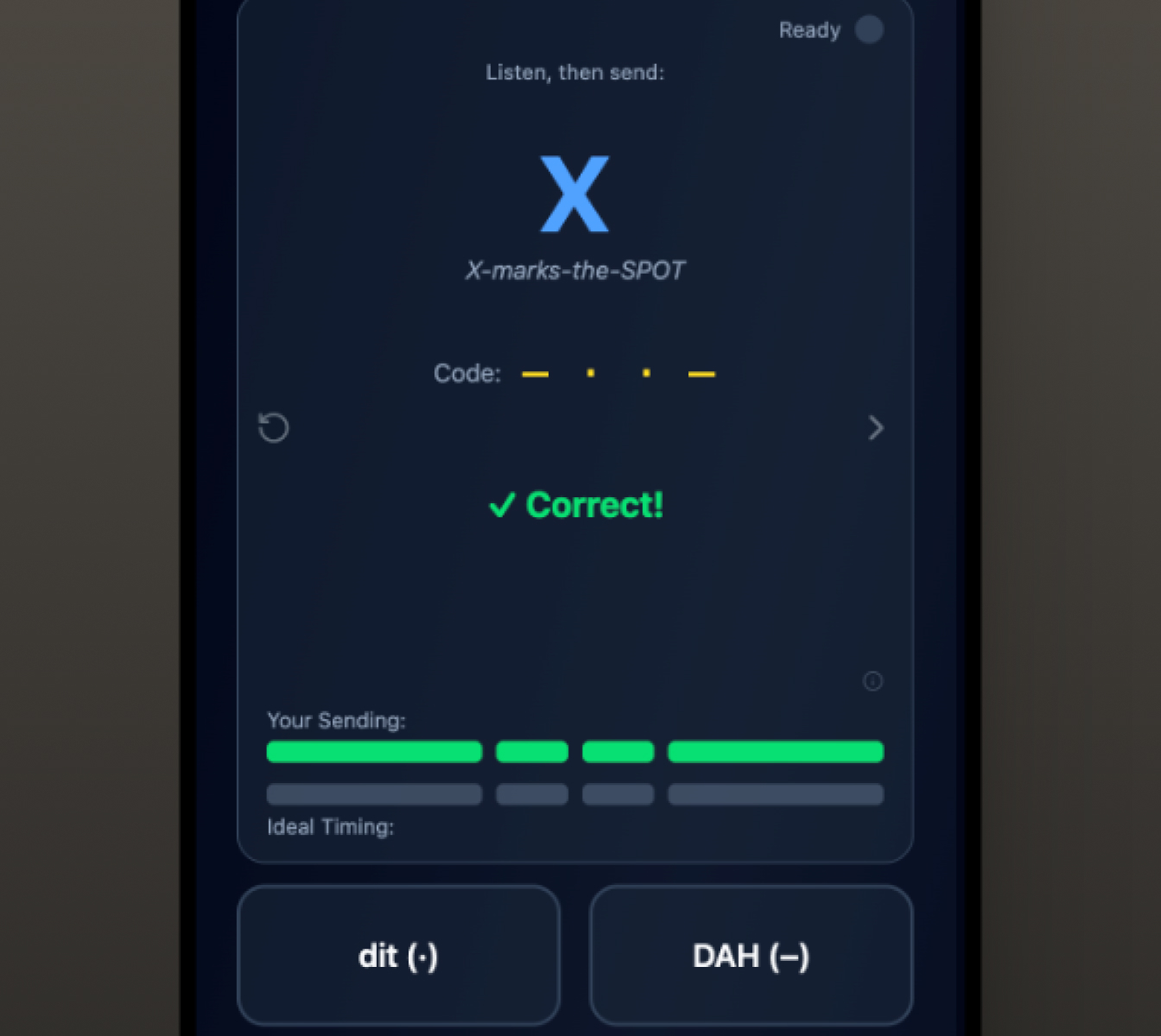
Visible when the learner wants it. Quiet when they don't.
Getting the input working was the engineering problem. Designing what the user experienced around it was the design problem, and the two were inseparable.
The decision to show timing feedback came from the transfer principle: a good score is worthless if the skill doesn't transfer. Accuracy tells you whether the right element was sent. Timing tells you whether the skill is being built correctly.
The feedback is visual and immediate: comparison bars showing sent timing against ideal timing for each element. Not graded. Not scored. Just visible. The goal is awareness, not judgment.
Earlier iterations used numerical feedback. Testing showed it was too cognitively demanding during active practice. Learners couldn't process numbers while also managing audio and physical input. Bars map naturally to duration without requiring conscious interpretation.
The toggle to hide timing feedback came from a different insight: beginners who see their timing before they've developed any timing instinct can become anxious about the data before they understand what it means. The toggle lets them choose when they're ready.
Feedback that feels like a mirror, not a scoreboard.
The detection flow.
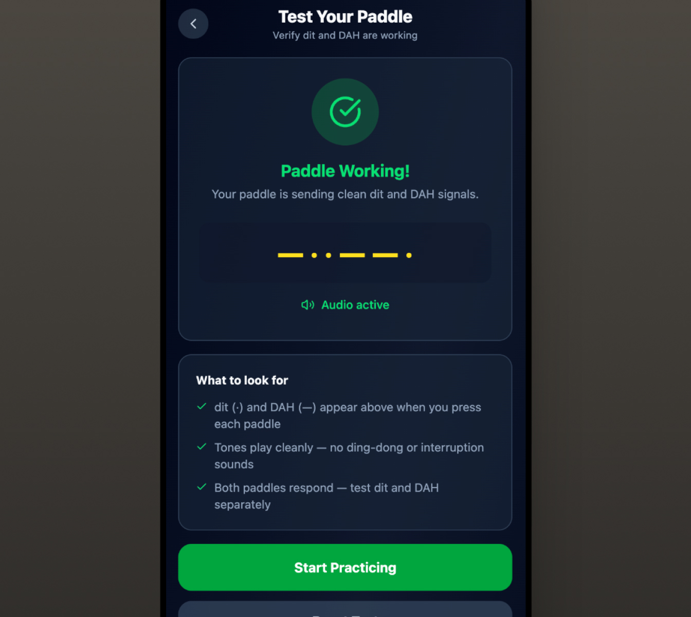
Thirty seconds of verification. One less failure mode.
Before any of the practice interaction was designed, there was a prior problem: how does a user know if their hardware is connected correctly?
A device connected through the adapter produces no visual confirmation that anything is working, no dedicated API to confirm receipt. The user might have the wrong input selected, or the adapter might not be connected correctly. They might be connected correctly and not know it.
The solution was a guided detection wizard: a short flow that walks the user through connection, asks them to send a test input, confirms receipt, and advances when successful. Platform-specific guidance for iOS, which requires additional system settings to route audio correctly, is built into the flow as a conditional branch.
The wizard exists because the first experience with hardware input is also the most fragile. Getting a user through that moment successfully changes their relationship with the product. Leaving them alone with a silent interface does the opposite.
Thirty seconds of verification eliminates the most demoralizing failure mode entirely.
Input that knows what it's listening for.
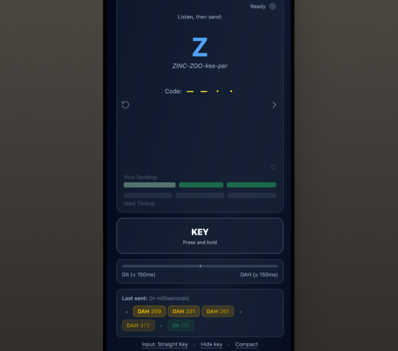
Two devices. One interface contract. Both tracked.
The two device types have different interaction signatures and required different implementations, but they share a single interface contract with the rest of the product. Either type can be used in any practice mode. Switching between them doesn't change the experience, only the input path.
A code audit during a recent instrumentation pass found that one device type had been silently excluded from behavioral tracking since the feature was first wired: a single guard clause that checked device type before deciding whether to record the event. A one-line fix. The kind of gap that only surfaces when you look for it deliberately.
What the browser learned to hear.
Web browser, physical device, professional quality practice.
A user can pick up their hardware, connect it to their phone or laptop, open a browser tab, and practice at professional quality. The timing feedback is real. The audio is precise. The detection is reliable. The skill transfers.
That happened because the design process started with what the interaction actually required, not what the toolkit made easy.
Outcomes
Hardware input works reliably across three platforms and three browsers in beta testing: macOS, Windows, and iOS, tested across Safari, Chrome, and Brave. The guided setup wizard successfully onboards users with no prior audio interface experience: the primary failure mode (a silent device during the first session) has been eliminated. Timing feedback was validated through beta sessions as genuinely useful without being intrusive. Both device types are now fully tracked in behavioral analytics, a gap found and closed during a code audit.
When a tap becomes a signal, the browser learns to hear what it was never designed to listen for.
One question led to another...
If interacting with the product becomes effortless, should every learner be looking at the same interface?